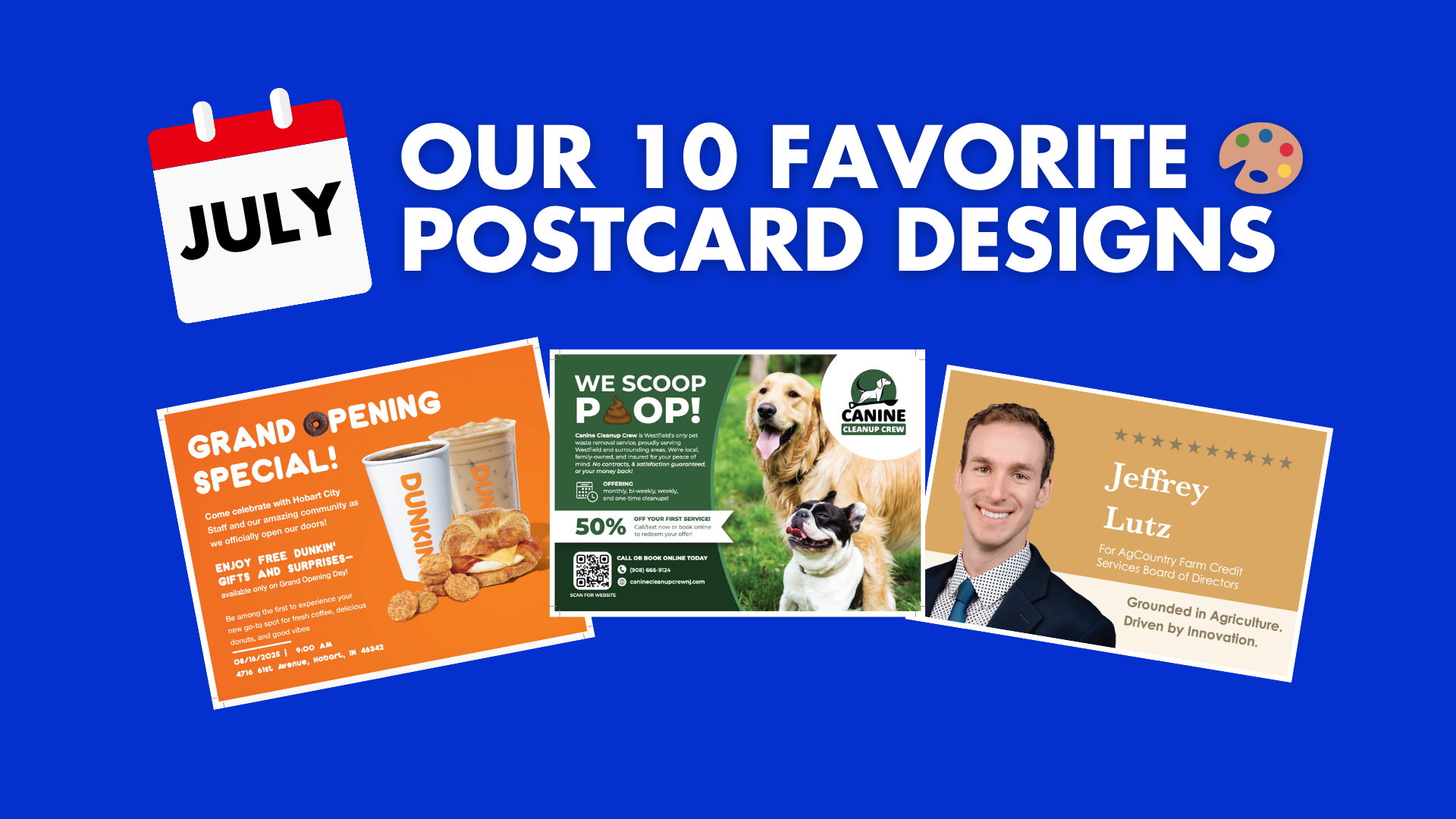
In July, we saw some truly stand-out postcard designs that combined bold visuals, clear offers, and personality-packed branding. Whether they were promoting tree services, CPAs, or delicious food, each one had something special that made it mailbox-ready.
Here are 5 of our favorites from this past month:
NOTE: Each of these postcards were designed by our very own in-house design team!
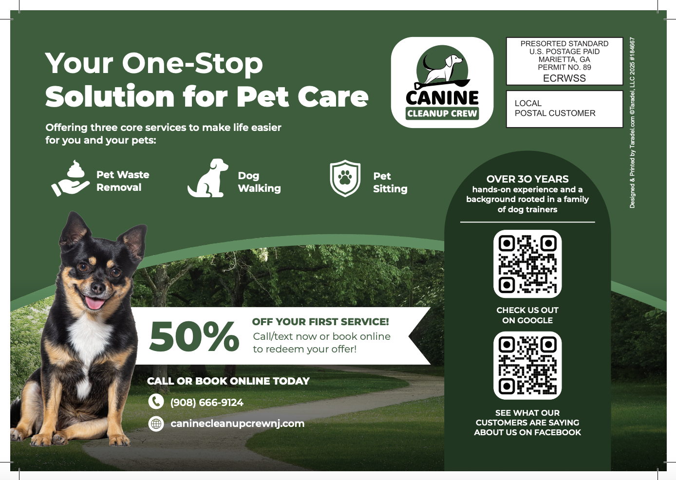
1. Canine Cleanup Crew – “We Scoop Poop” Postcard

Why We Love It:
This card doesn’t shy away from its mission—and that’s exactly why it works. With a humorous headline, bold visuals, and a generous 50% off offer, it’s a perfect mix of personality and professionalism. The back continues the momentum with icons, testimonials, and trust signals like “Over 30 Years” and family-owned.
Design Highlights:
-
Attention-grabbing “WE SCOOP POOP” headline with emoji-style graphic
-
Dual QR codes for Google and Facebook social proof
-
50% off offer + clear call-to-action to book or call
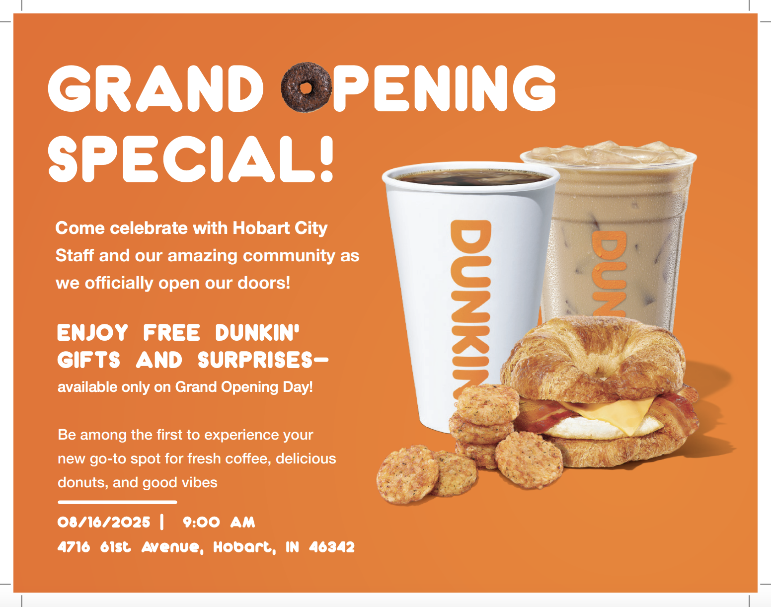
2. Dunkin’ – Grand Opening Postcard
 Why We Love It:
Bright, energetic, and packed with value—this double-sided design invites the community to a grand opening celebration and follows up with twelve strong coupon offers. From free donuts and drinks to $100+ in potential savings, it’s built to boost store visits fast.
Design Highlights:
-
Iconic orange color palette and vibrant food imagery
-
“Grand Opening Special” callout with date, time, and location
-
Tearable-style coupon layout with barcodes and map
3. Jeffrey Lutz – AgCountry Board Campaign Postcard

 Why We Love It:
This political mailer strikes the perfect tone of trust and relatability. The front positions Jeffrey as an innovative leader grounded in agriculture, while the back adds depth with personal values, real-world experience, and a family photo that brings it all home.
Design Highlights:
-
Warm, earthy color palette with clean typography
-
“Real farmers with real solutions” closing line reinforces authenticity
-
Heritage Meats imagery supports farming credibility
4. Easy Tree Service – Summer Promo Postcard

 Why We Love It:
With bold text, active photos, and a clear-cut offer, this card does exactly what a tree service mailer should: highlight safety, savings, and professionalism. The back builds even more trust with a 5-star review, strong testimonial, and clear QR path to get a quote.
Design Highlights:
-
Dynamic photos show tree trimming in action
-
Summer promo discounts clearly outlined with expiration date
-
Over 500 5-star Google reviews headline adds instant credibility
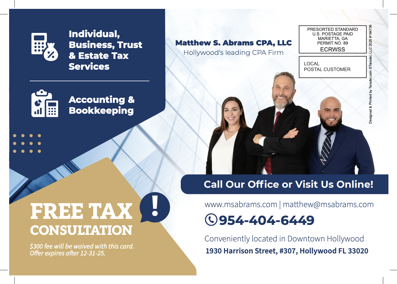
5. Matthew S. Abrams CPA – Tax Services Postcard

Why We Love It:
This postcard delivers a polished and trustworthy look for a CPA firm, with service breakdowns, a free consultation offer, and multiple contact methods. The second side continues with strong copy on personalized support and audit protection—exactly what clients want to see in a financial partner.
Design Highlights:
-
Blue and gold color scheme feels professional and modern
-
$300 consultation offer with expiration date creates urgency
-
Strategic tax help and peace-of-mind messaging throughout
6. J&K Powerwashing – “Curb Appeal Starts Here” Postcard

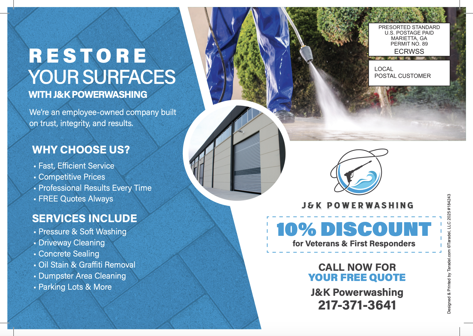
Why We Love It:
This sleek powerwashing design reinforces the visual payoff of the service with a clean layout and bold “10% Off” promo. The back includes pricing transparency and a straightforward breakdown of service areas.
Design Highlights:
-
Blue/white color palette mirrors the clean theme
-
Clear list of surfaces they power wash
-
“Veteran-owned” and “licensed & insured” credibility
7. Lake Norman Christian School – Open House Postcard

 Why We Love It:
This school postcard uses real student photography and bold colors to drive interest in its open house event. It combines faith, academics, and community into one approachable and visually compelling layout.
Design Highlights:
-
Real student collage builds connection
-
QR code links to more info or registration
-
Key benefits highlighted (academics, athletics, values)
8. Ohio Valley Services Group – Full-Service Promo Postcard

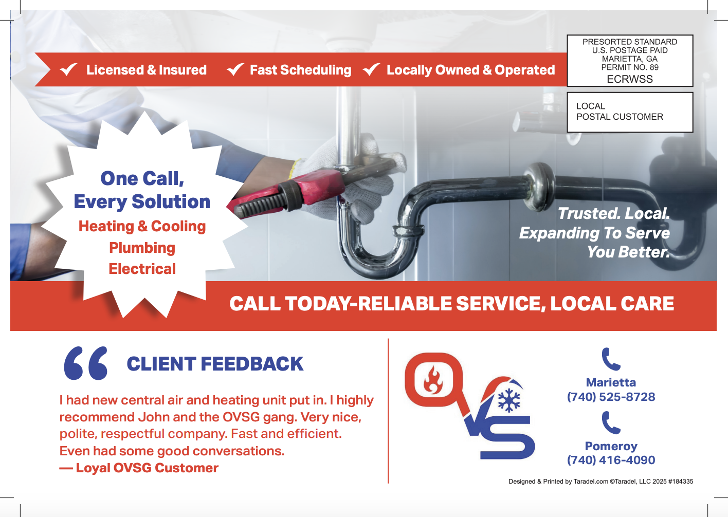
Why We Love It:
This postcard communicates professionalism with a polished layout and straightforward offer. It covers multiple home services—plumbing, electrical, HVAC—and gives reasons to trust all in one pass.
Design Highlights:
-
Service icons make the range instantly clear
-
Trust language: “Serving the Valley for 15 Years”
-
“One call does it all” message simplifies the pitch
9. Little Creek Construction – Outdoor Living Postcard

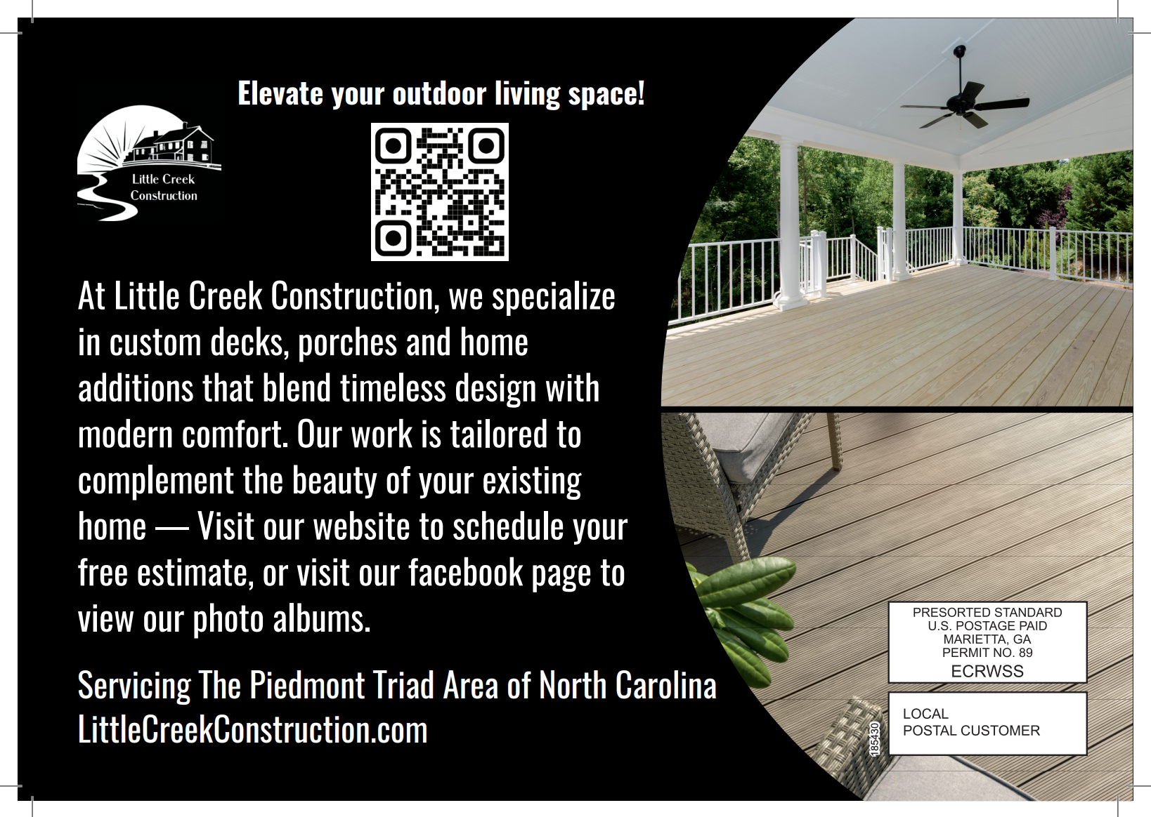
Why We Love It:
This home improvement card stands out with premium photography and a sophisticated layout. It reflects the high-end nature of the service while still offering a free estimate and showcasing local work.
Design Highlights:
-
Stunning deck/patio photography grabs attention
-
Free consultation offer drives response
-
Elegant black-and-white contrast boosts perceived value
10. Lotus Pho & Grill – Restaurant Promo Postcard

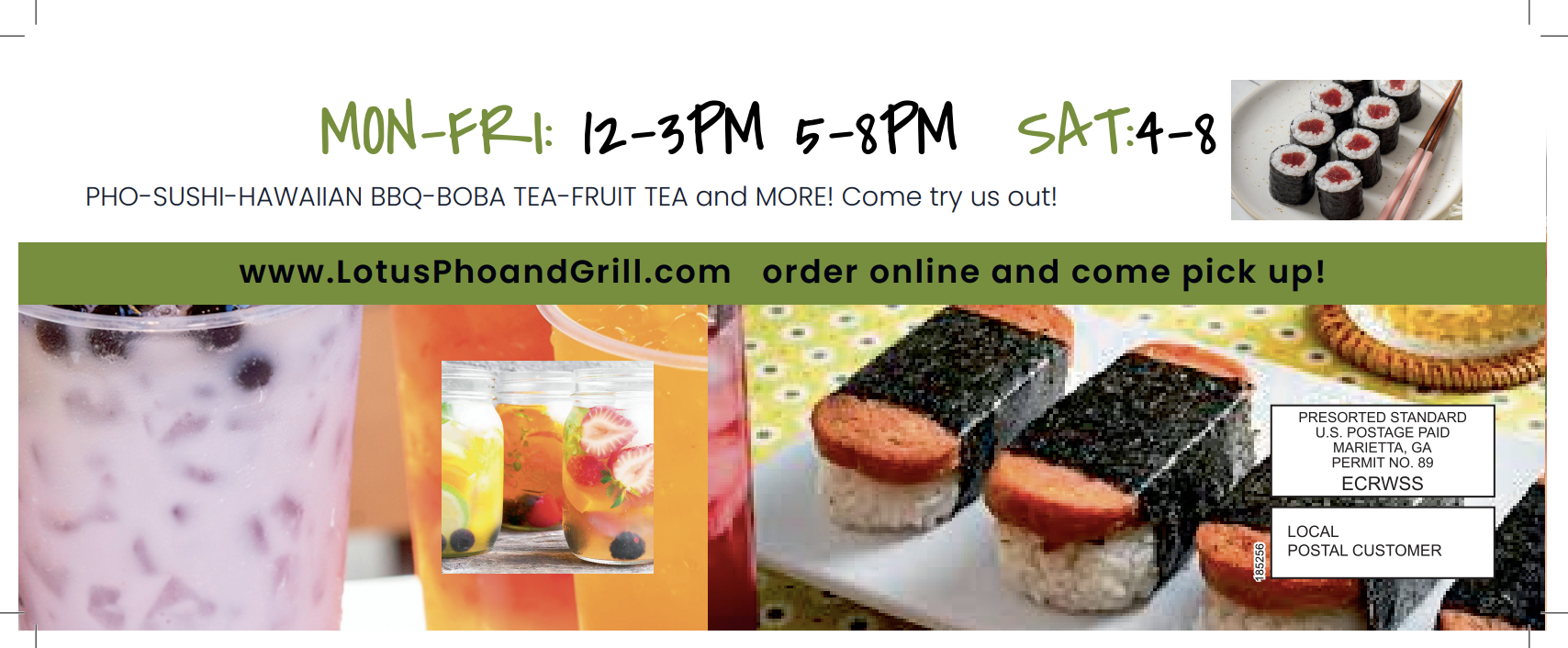
Why We Love It:
Colorful, vibrant, and packed with flavor—this postcard highlights pho, sushi, and bubble tea with visuals that sell themselves. The included coupon and “Now Open” callout invite new customers in right away.
Design Highlights:
-
Bold, mouthwatering food photos
-
Strong “FREE item” offer with minimum purchase
-
Icons show dine-in, takeout, and delivery options
Want your business to stand out in the mailbox like these did?
Start designing your postcard today—free templates and pro support included.

.png?width=352&name=blog%20featured%20images%20(64).png)