Typography Tricks That Make Your Postcards Readable at a Glance
For your postcard to be readable at a glance, your typography needs to make key information instantly clear. You should be able to communicate your offer, identity, and next step within seconds of someone picking up the card. That only happens when font choice, spacing, and structure work together to reduce the reader's effort.
Printing Impressions magazine reveals that direct mail achieves up to 9x higher engagement, significantly outperforming many digital-only campaigns. This performance depends heavily on how quickly a message can be processed.
When typography is unclear or cluttered, attention drops even if the postcard reaches the right audience. Small design decisions determine whether your message is understood immediately or ignored.
What Is Typographic Hierarchy and Why Does It Matter for Postcards?
A postcard gives you one face, one moment, and one opportunity to communicate. Typographic hierarchy is the system that tells your reader's eye where to look first, second, and third. When hierarchy is weak, attention scatters.
When it is strong, the eye moves naturally without effort. Your postcard needs three levels working simultaneously:
- Main offer
- Business identity
- Call to action
Each level must differ visually through size, weight, and placement. In effective postcard design, this structure reduces confusion and speeds comprehension. It is the foundation of focusing on readability for home repair, medical, and real estate postcards. At Taradel, we help you create professionally designed postcards with a clear visual hierarchy that guides attention to your most important message and encourages action.
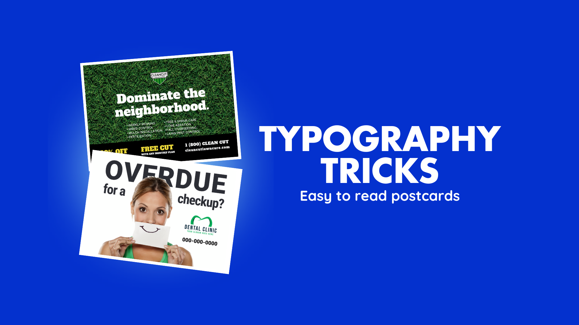
Which Fonts Are Most Readable on a Printed Postcard?
Readable postcard fonts prioritize clarity over decoration, especially in fast scanning environments. Simple typefaces consistently outperform decorative ones on printed cardstock. Effective font directions include:
- Clean sans-serif styles
- Simple serif styles
- Consistent stroke contrast
Your industry determines the right pairing. Home repair businesses perform well with a geometric sans-serif headline paired with a humanist sans-serif body. Medical practices benefit from a humanist serif headline with a neutral sans-serif body.
Real estate professionals should use a transitional serif headline with a condensed sans-serif for the CTA block. Good typography design ideas always prioritize clarity over style.
How Color Contrast Affects Postcard Typography Readability
Strong contrast improves recognition speed. Weak contrast forces visual strain before your offer is even processed. Effective contrast choices include:
- Dark text on light backgrounds
- Solid overlays behind reversed text
- Clear separation between text and imagery
Poor contrast examples include:
- Light text on busy imagery
- Low difference between text and background color
- Color clashes that reduce overall clarity
Apply a minimum contrast ratio of 4.5:1 for body text and 3:1 for display type, particularly for medical and home repair postcards targeting older demographics. Color temperature also matters. Cool palettes communicate professionalism and trust for medical and real estate postcards.
Warm palettes signal urgency and action for home repair offers. Choosing your palette intentionally makes your typography design ideas feel deliberate rather than accidental.
Spacing Decisions That Keep Your Postcard Readable
Spacing controls how comfortably your reader moves through your content. Three spacing decisions determine whether your layout feels professional or cluttered. The three adjustments to make are:
- Leading at 120% to 145% of the point size
- Tracking adjusted for all-caps headlines
- Deliberate white space between content groups
Correct spacing ensures your reader moves through your content without friction. Without it, even the right fonts feel cluttered, and your message loses impact before it lands.
CTA Placement Mistakes That Cost You Responses
Visual weight controls where the eye lands and stops on your postcard. The most damaging mistake is treating all elements equally. When your headline, body copy, and CTA compete at the same size and weight, nothing stands out as the priority, and your reader moves on without acting.
Your CTA must be the second-strongest typographic element on the card after your headline. Set it in a color that appears nowhere else on the postcard and surround it with white space so the eye lands there naturally. Elements that can make your CTA impossible to miss include:
- Separated layout grouping
- Readable contact formatting
- Short, direct instructions
- Clear visual emphasis
Focusing on readability means your reader should never have to search for what to do next. A well-placed CTA makes the difference between a postcard that generates a response and one that gets discarded.
Frequently Asked Questions
How Many Fonts Should a Postcard Use?
Limit your postcard design to two font types. One for display elements and one for body copy and CTA. Avoid:
- Multiple font families
- Frequent style changes
- Decorative variations
A third font is only acceptable for legal disclaimers at 7pt to 8pt. More than two primary fonts fracture visual cohesion across a surface that cannot recover from that fragmentation.
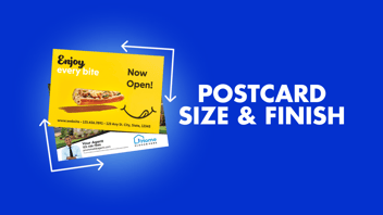
What Is the Best Postcard Size for Maximum Readability?
A 6x9 postcard gives your typography more breathing room than a 4x6 format. More surface area means better spacing between hierarchy levels, a larger CTA, and more deliberate white space. All three directly improve how quickly your reader processes your message.
How Do You Measure the Success of Your Postcard Typography?
Response rate is your most direct indicator. Track how many recipients acted on your postcard by:
- Using a dedicated phone number or URL
- Adding a unique promo code
- Monitoring QR code scans
If response rates are low despite a strong offer, your typography and layout should be the first elements to revisit. Clear, well-structured type that guides the eye consistently produces higher engagement than a cluttered design carrying the same message.
Capture Attention and Drive Action With Postcard Typography
Strong postcard results come from clear structure, not decorative detail. Intentional typography makes your message easier to understand and more likely to drive action. With the help of an expert postcard design team, you can turn every mailing into a measurable response driver.
At Taradel, we have been helping small businesses drive measurable results since 2003. Our seasoned marketing experts, led by Jim Fitzgerald, combine professional typography, powerful design tools, and multichannel campaign tracking across direct mail, social media, and streaming TV.
With over 500 million mail pieces processed, we deliver agency-quality results affordably. Get in touch and let us turn your next campaign into your best one yet.