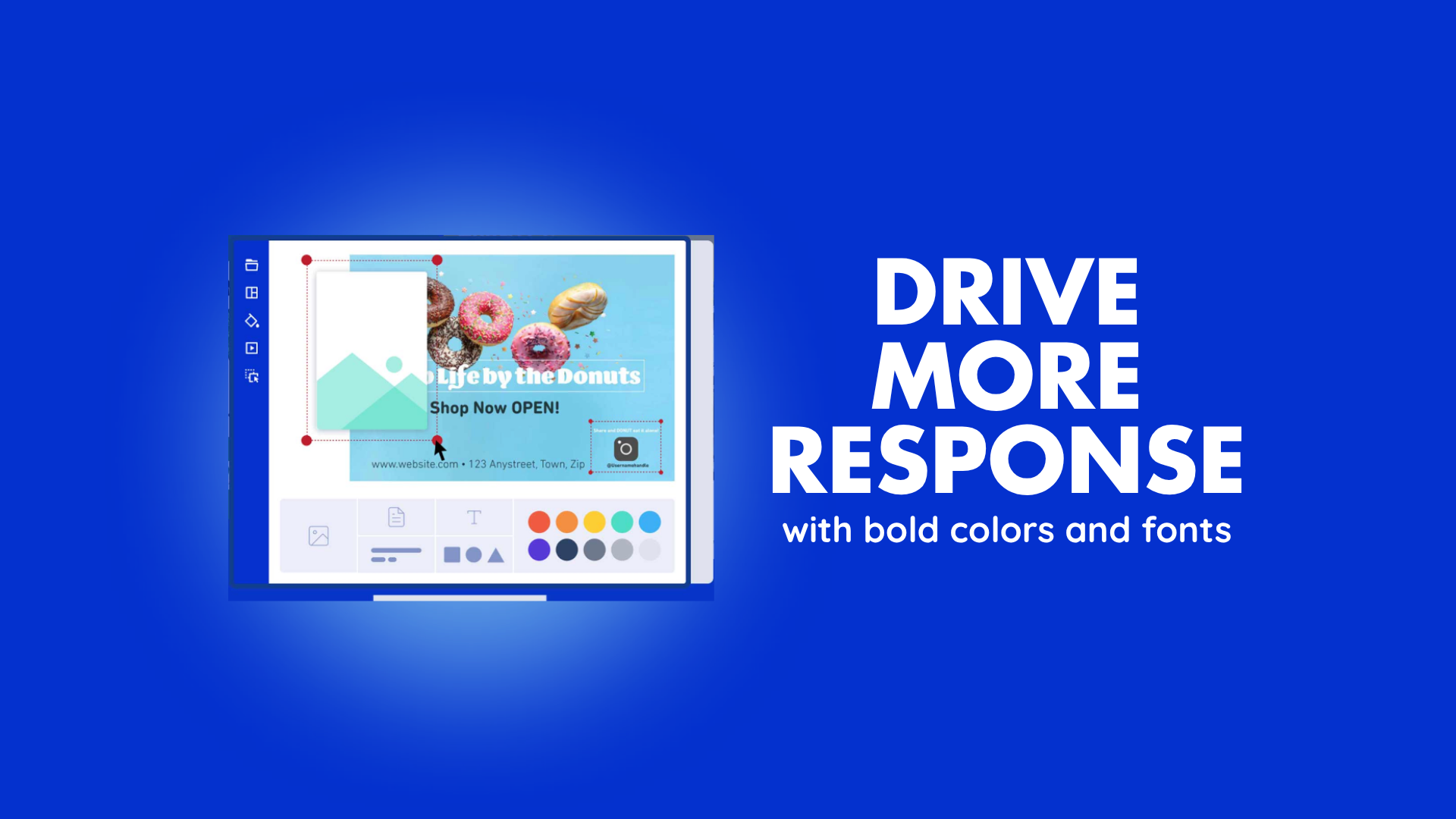
Using Bold Colors and Fonts to Drive More Postcard Responses
Using bold colors and the right fonts can dramatically improve your postcard responses. When a piece of mail lands in someone's mailbox, it has just a few seconds to grab attention before it gets set aside.
Vibrant colors combined with strong, readable typography give your message that important edge. It becomes more likely that people will stop and read what you have to say.
According to direct mail research, colorful postcards can achieve up to 42% higher response rates than black-and-white versions. Those responses can translate into significantly more leads and new customers for your business.
We have seen these results repeatedly while helping service companies grow through direct mail. Developing colorful, bold postcard design options makes you seem trustworthy and memorable.
Color Psychology in Marketing: Choosing Hues That Prompt Action
Color choices make a real difference when you want more postcard responses. People decide in seconds whether to keep or toss your mail, and the right hues guide those quick decisions. You can use color psychology in marketing to spark any number of feelings, such as:
- Urgency
- Trust
- Excitement
The choice of color all depends on what you offer as a business.
Blue signals reliability and calm. It helps recipients feel confident about calling for a repair quote or booking a check-up.
Green works well for home services. It suggests growth and freshness, like a newly painted room or a well-maintained property.
Red or orange adds energy and creates urgency for limited-time offers, such as "Schedule Your Free Estimate This Month."
Studies confirm the power behind these choices. One analysis highlighted in Data Force found that green paper increased mail survey response rates by approximately 9.1% compared to white paper.
When you pick hues that align with your message, recipients connect emotionally and act faster.
Effective Font Choices for Mail: Making Every Word Count
Fonts play a quiet but powerful role in how people read your postcard. You need type that feels clear and professional the moment someone flips the card over. Clean sans-serif options deliver strong results for direct mail because they stay sharp and easy to scan, even at a glance. Examples include:
- Helvetica
- Arial
- Century Gothic
- Verdana
These keep headlines bold and body text readable and are popular choices both on paper and digitally.
Place the main offer in a larger, heavier weight so it jumps out first. Pair that with a slightly lighter version for supporting details. Experts from Shopify recommend these simple choices because they improve readability and help more people reach your call to action without strain.
Handwritten-style fonts can add a personal touch when you use them sparingly for short notes or signatures. They make the piece feel warmer without sacrificing clarity. Avoid overly decorative scripts or tiny sizes because they slow readers down and reduce your chances of a reply.
The combination of strong fonts and your chosen colors creates a postcard that looks polished and trustworthy. Service businesses that get this right see their mail perform like a personal invitation rather than just another piece of advertising.
What Are Some Simple Card Messages?
Short, direct messages help increase postcard response rates the most because you have limited space and only seconds to capture interest. Focus on one clear benefit and one easy next step. Here are examples tailored to the industries we serve most often.
For home repair businesses, try: "Need a Leak Fixed Fast? Get Your Free Quote Today. Call Now and Save 20% This Month."
Medical practices can use: "Stay Healthy with Your Annual Check-Up. Schedule in Minutes and Receive a Friendly Reminder."
Real estate agents often succeed with: "Your Dream Home Awaits in This Neighborhood. See Recent Sales and Book a Private Tour."
Keep every message benefit-focused and action-oriented. Include your phone number or a QR code in large type so recipients can respond right away.
A simple offer, such as a free consultation or seasonal discount, gives people a reason to reply immediately instead of setting the card aside.
Measuring Results and Refining Your Approach
You gain the clearest picture of success by tracking every campaign. Include a unique phone number or QR code on each postcard so you know exactly which design drove the response. Watch metrics such as:
- Open rates
- Call volume
- Appointment bookings
- Website visits
Review the data after each mailing. Note which color combinations and font pairings generated the strongest postcard responses.
Consistent measurement turns good postcard design strategies into great ones that keep delivering more leads over time.
Frequently Asked Questions
How Often Should Businesses Mail Postcards for Best Results?
Most service businesses see the strongest postcard responses when they mail to the same audience every three to six weeks.
Campaigns that send a short series of three postcards spaced about 21 days apart often generate the best long-term results. Shorter gaps risk the mail feeling like junk, while longer ones let interest fade.
What Common Design Errors Reduce Postcard Responses?
Cluttered layouts rank among the top design errors that hurt performance. When too many elements fight for attention, recipients tune out before they read the offer. Low-resolution images or generic stock photos also weaken the impact because they fail to connect with the customer's needs.
Another frequent issue appears when the call to action sits in small type or blends into the background. Finally, skipping a clear, benefit-focused headline leaves people unsure why they should respond.
How Does Multichannel Marketing Amplify Direct Mail Success?
Pairing postcards with digital channels creates a powerful multiplier effect. When someone receives your mail and later sees a matching ad on social media or streaming TV, the message gains instant familiarity.
The physical postcard delivers a memorable first impression. Digital follow-ups provide easy next steps.
Boost Your Postcard Responses With Bold Colors and Fonts
Bold colors and thoughtful font choices give your postcards the standout power they need to generate more postcard responses.
The best postcard design strategies work even better when you have the right support behind them. At Taradel, we provide everything in one easy platform so you can target the perfect local audience and measure every result in real time.
Begin your campaign today and watch your postcard responses climb.